

The Tinkaton Family
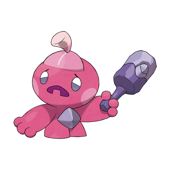
Today's Pokemon line was a fandom darling the moment it was revealed, and conceptually I understand why that is, sure. It's a fairy/steel Pokemon consisting of a weird little pink pixie thing that builds and maintains a scrap metal hammer to wield as a weapon, the hammer growing exponentially larger with every evolution. A fun enough idea.
Unfortunately, this is the ugliest Pokemon I have ever seen in my life. I do not mean that this is an ugly creature, mind you, I'm not sure I really have a concept of that. All my favorite Pokemon are consistently rated the "ugliest" in the whole franchise. What I mean here is artistically ugly, from a character design or even graphic design standpoint. It is a collection of individually uninteresting geometric shapes arranged together in a visually unappealing way. You have featureless cylinder feet, a greyish pyramid chunk to justify why the organism itself is a steel type I guess, fat hot dog arms with ball fingers, a plain ball head, a mouth that's just a black oval with one Jack O' Lantern style square tooth, sticker-like shiny eyes and none of these things complement one another in any really cohesive way. Worst of all? That flat, pale pink semicircle sticking upwards out of the forehead exactly - EXACTLY - like the tip of an ingrown toenail, with a cream colored topnot hairdo sprouting not from the actual head, but from the tip of this toenail thing. Why?!
Unfortunately, this is the ugliest Pokemon I have ever seen in my life. I do not mean that this is an ugly creature, mind you, I'm not sure I really have a concept of that. All my favorite Pokemon are consistently rated the "ugliest" in the whole franchise. What I mean here is artistically ugly, from a character design or even graphic design standpoint. It is a collection of individually uninteresting geometric shapes arranged together in a visually unappealing way. You have featureless cylinder feet, a greyish pyramid chunk to justify why the organism itself is a steel type I guess, fat hot dog arms with ball fingers, a plain ball head, a mouth that's just a black oval with one Jack O' Lantern style square tooth, sticker-like shiny eyes and none of these things complement one another in any really cohesive way. Worst of all? That flat, pale pink semicircle sticking upwards out of the forehead exactly - EXACTLY - like the tip of an ingrown toenail, with a cream colored topnot hairdo sprouting not from the actual head, but from the tip of this toenail thing. Why?!
Tinkatink evolves at level 24 into Tinkatuff, and it's basically an improvement, I guess. There's a little more to the arms, fingers and torso, the metal chunk on the chest has become a couple of spines or blades that stick out of its waist in an unobtrusive way, the mouth now has an upper tooth, and the toenail with the topknot has thankfully grown into an entire full hairdo that does not resemble any kind of podiatric malady. I'm not sure I like the even triangles that make up the start of the hair, however; it doesn't look so much like hair as like a broken cartoon easter egg on top of its head, with a giant poofy ponytail, and I still don't think the flat cut-off legs, too-round head or the square flesh teeth really mesh with the rest.
It's a design sorely lacking in what's known as a "shape theory," wherein the different geometric shapes used by a character's design should balance, complement, or meaningfully contrast one another. It doesn't always make or break a design design, but generally if your character's basic form is mostly circles, it can feel kind of jarring to put a bunch of rectangles on their head and only on their head without any special reason for it. Lots and lots of Pokemon actually break their Shape Theory somewhere or lack one to begin with, but for whatever reason, the geometric formula of this Pokemon sticks out to me in a worse way than usual.
The hammer weapon, on the other and, is really nice looking. It's visibly the rattle-like hammer of the first stage as a base, with a much longer handle attached, and several large metal sheets partially enclosing it in a huge, semi-hollow, unfinished mallet head! It's detailed so organically, it doesn't look like it's from the same game as its stiffer and more plasticy wielder. The pokedex now informs us that these Pokemon build their hammers from steel-type Pokemon that they have presumably hunted down and slain. That's both thoughtfully ecological and morbidly funny, really reminding you that this thing may be superficially shaped like a little person, complete with a recognizable "hairstyle" and the use of a constructed weapon, but it's still a creature; a creature that roams the wilderness looking for other creatures to dismember. This does make it kind of irksome that this is another of those gender-locked humanoids, however. This non-human animal beast monster is 100% female in-game why? Anyone can wear a ponytail and a magenta-brown ensemble! I don't recommend it, but anyone CAN.
A quick twitter search on this Pokemon line also tells me that I have to address pink hedgehog from the sonic unless I want 400 messages asking why I didn't. Amy Rose, however, is neither the first or the last smallish feminine entity with a huge mallet weapon, or even the combination of a huge mallet weapon and pink color scheme; that's an anime gag at least as far back as the 70's! Heck, he's not a girl (or anything, really, except maybe a living dollop of liquid oblivion) but even Kirby is a little pink being that sometimes fights with a disproportionately sized hammer.
It's a design sorely lacking in what's known as a "shape theory," wherein the different geometric shapes used by a character's design should balance, complement, or meaningfully contrast one another. It doesn't always make or break a design design, but generally if your character's basic form is mostly circles, it can feel kind of jarring to put a bunch of rectangles on their head and only on their head without any special reason for it. Lots and lots of Pokemon actually break their Shape Theory somewhere or lack one to begin with, but for whatever reason, the geometric formula of this Pokemon sticks out to me in a worse way than usual.
The hammer weapon, on the other and, is really nice looking. It's visibly the rattle-like hammer of the first stage as a base, with a much longer handle attached, and several large metal sheets partially enclosing it in a huge, semi-hollow, unfinished mallet head! It's detailed so organically, it doesn't look like it's from the same game as its stiffer and more plasticy wielder. The pokedex now informs us that these Pokemon build their hammers from steel-type Pokemon that they have presumably hunted down and slain. That's both thoughtfully ecological and morbidly funny, really reminding you that this thing may be superficially shaped like a little person, complete with a recognizable "hairstyle" and the use of a constructed weapon, but it's still a creature; a creature that roams the wilderness looking for other creatures to dismember. This does make it kind of irksome that this is another of those gender-locked humanoids, however. This non-human animal beast monster is 100% female in-game why? Anyone can wear a ponytail and a magenta-brown ensemble! I don't recommend it, but anyone CAN.
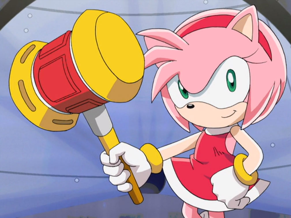
A quick twitter search on this Pokemon line also tells me that I have to address pink hedgehog from the sonic unless I want 400 messages asking why I didn't. Amy Rose, however, is neither the first or the last smallish feminine entity with a huge mallet weapon, or even the combination of a huge mallet weapon and pink color scheme; that's an anime gag at least as far back as the 70's! Heck, he's not a girl (or anything, really, except maybe a living dollop of liquid oblivion) but even Kirby is a little pink being that sometimes fights with a disproportionately sized hammer.
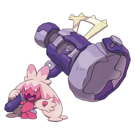
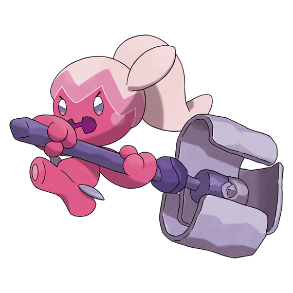
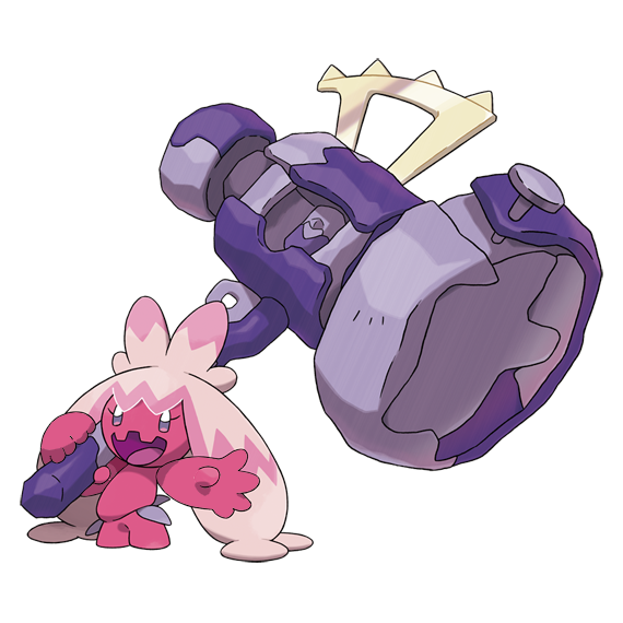
Finally, we come to Tinkaton, and the design finally starts to go somewhere...but only just as it reaches its end. The mallet is now massive with a hammer head larger than the actual Pokemon, and still has the same crude, cobbled-together look, so no complaints there. The dex says it will even use this hammer to knock rocks into the air at Corviknight!
But as for the fairy, the head and body have remained largely the same, except that the mouth now has two blocky upper teeth and no visible lower ones. The hands now each have four fingers and a thumb, and the hair has grown to look like two "pigtails" with a bow on top. These pigtail things are so huge that they rest on the ground, ending in structures like flat, circular sucker toes, and I kind of like that. It visually frames the darker magenta critter a bit better, and feels like a logical adaptation to keep it anchored to the ground as it swings the mallet.
I still think the head and the legs are a little too simple and bland, however; the spherical head forces the flat decal of a mouth to curve inward in a way that doesn't really look good from any angle but head-on, the hair still has that "jagged eggshell" element as "bangs" and it adds an even sharper jagged pink patterning.
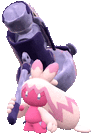
If one thing really bugs me, though, it's what this evolution does to the arms. Except for their magenta thumbs, the arms are now the same color as the hairdo, kind of like the creature is suddenly wearing gloves. That isn't bad in itself, but it is bad that they decided the arms and hair should be the same color as soon as the hair became the default visual backdrop to the arms, making the design look more muddled and unclear. This is most noticeable in the actual graphical style of its debut game, which doesn't have a lineart effect to clarify the outline of each body part:
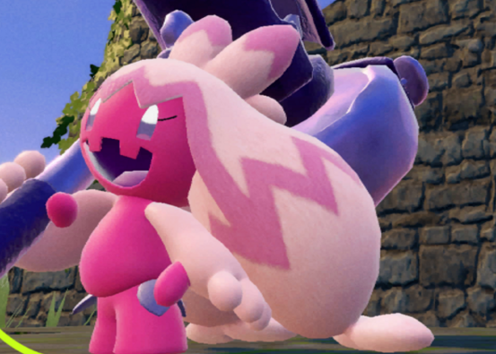
I'm sorry if this sounds like a petty nitpick to some of you, but pale blob arms against pale blob hair is like a day one artist mistake. Visual readability is character design 101, and it's actually the one thing most Pokemon get right! No matter how much you may dislike a given Pokemon's design, nearly every physical element of nearly every Pokemon stands out at just a glance thanks to silhouette, color scheme or both. We can even demonstrate this fact with both my personal favorite and (only semi-seriously) least favorite:
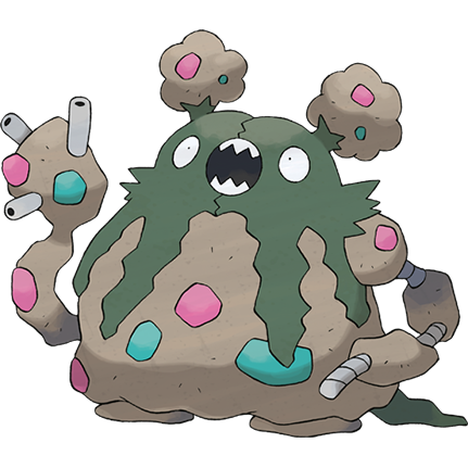
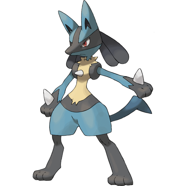
I think Garbodor exudes charm while Lucario is kind of a clunky mess, but they both have undeniably competent readability; you can easily differentiate their bodies, limbs, facial features and decorative flair from just about any angle. Change Tinkaton's arm thingies back to pink, and it becomes much easier to make out its body shape from a distance
I've now spent a little too much time out of my life critiquing this Pokemon's every eyelash, and I really didn't mean to. It's just that character design is my biggest "creative interest," I like to break down what does and doesn't work for me in a creature, and this particular set of "problems" (for me personally) have never come together like this on just one Pokemon before. I like to think reviews like these might even be helpful, sometimes, to some of you artists who might not have had the right words to describe what bothers you about a given design. Maybe even one you've been working on yourself, and you just couldn't place why it wasn't feeling quite right, yet?
I will also say that a Pokemon employing a metal mallet feels born to be another Pokemon with Dhelmise's "Steelworker" ability, which boosted Dhelmise's own steel type attacks without it having to be steel type and carry steel's weaknesses itself. I guess for its concept to really work, it needs a base typing that resists steel-type attacks, which only leaves steel, fire, electric and water, but if it had been an electric or fire type, that would have also explained how it can fuse its steel together, like by a welding process!
Overall, I feel like this line is most popular for the gimmick of a little pink fairy with a bow on its head that's actually a murderous, metalworking gremlin, whereas people's feelings about its design are more varied and mine especially leans more towards it feeling a little underdone.
But as for the fairy, the head and body have remained largely the same, except that the mouth now has two blocky upper teeth and no visible lower ones. The hands now each have four fingers and a thumb, and the hair has grown to look like two "pigtails" with a bow on top. These pigtail things are so huge that they rest on the ground, ending in structures like flat, circular sucker toes, and I kind of like that. It visually frames the darker magenta critter a bit better, and feels like a logical adaptation to keep it anchored to the ground as it swings the mallet.
I still think the head and the legs are a little too simple and bland, however; the spherical head forces the flat decal of a mouth to curve inward in a way that doesn't really look good from any angle but head-on, the hair still has that "jagged eggshell" element as "bangs" and it adds an even sharper jagged pink patterning.
If one thing really bugs me, though, it's what this evolution does to the arms. Except for their magenta thumbs, the arms are now the same color as the hairdo, kind of like the creature is suddenly wearing gloves. That isn't bad in itself, but it is bad that they decided the arms and hair should be the same color as soon as the hair became the default visual backdrop to the arms, making the design look more muddled and unclear. This is most noticeable in the actual graphical style of its debut game, which doesn't have a lineart effect to clarify the outline of each body part:
I'm sorry if this sounds like a petty nitpick to some of you, but pale blob arms against pale blob hair is like a day one artist mistake. Visual readability is character design 101, and it's actually the one thing most Pokemon get right! No matter how much you may dislike a given Pokemon's design, nearly every physical element of nearly every Pokemon stands out at just a glance thanks to silhouette, color scheme or both. We can even demonstrate this fact with both my personal favorite and (only semi-seriously) least favorite:
I've now spent a little too much time out of my life critiquing this Pokemon's every eyelash, and I really didn't mean to. It's just that character design is my biggest "creative interest," I like to break down what does and doesn't work for me in a creature, and this particular set of "problems" (for me personally) have never come together like this on just one Pokemon before. I like to think reviews like these might even be helpful, sometimes, to some of you artists who might not have had the right words to describe what bothers you about a given design. Maybe even one you've been working on yourself, and you just couldn't place why it wasn't feeling quite right, yet?
I will also say that a Pokemon employing a metal mallet feels born to be another Pokemon with Dhelmise's "Steelworker" ability, which boosted Dhelmise's own steel type attacks without it having to be steel type and carry steel's weaknesses itself. I guess for its concept to really work, it needs a base typing that resists steel-type attacks, which only leaves steel, fire, electric and water, but if it had been an electric or fire type, that would have also explained how it can fuse its steel together, like by a welding process!
Overall, I feel like this line is most popular for the gimmick of a little pink fairy with a bow on its head that's actually a murderous, metalworking gremlin, whereas people's feelings about its design are more varied and mine especially leans more towards it feeling a little underdone.
All Scarlet/Violet sprite animations ripped by adamsb0303!


FIRST PREV ARCHIVE NEXT LATEST