


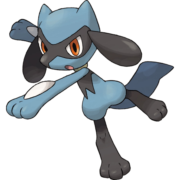
At last, we meet. The pokemon whose evolution is consistently voted one of the most popular, most beloved in the entire property, and the pokemon whose evolution represents the "zero" on my personal rating scale. You know what? I'm going to skip Riolu. Riolu is only a child. Riolu can't help that it has a bunch of nonsense parts taped all over its design.
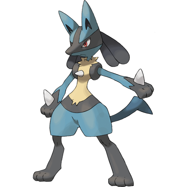
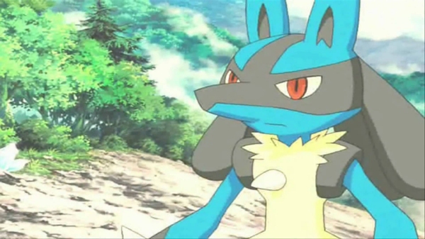
So, here it is, the steel/fighting "aura" pokemon, Lucaryoo, and one of my least favorite pokemon designs. People have known this about me for years, but some are under the impression that my dislike for this pokemon simply stems from the disproportionate popularity of an anthropomorphic dog. I'm not that petty. That's not *the* reason. In fact, I have so many reasons that I'll need to tackle them in list format...
The Ten Things I Don't Like About Lucararios
 First, The Stripes. Those perfectly straight, rigidly angular black stripes on Lucarion's face do not look good at all wrapped around a roughly globular head, and they don't really match the jagged black ends of its paws, nor the black "belt" stripe, nor those weird black donuts on its shoulders. None of these markings feel like they synch up. This is a problem with a lot of Pokemon, yes, but it feels especially awkward on one that was so heavily hyped.
The Hair. Is Lurciaro supposed to have "dreadlocks?" Is that what those are? Because they don't look like them. They look like fat, smooth, solid plastic tear drops nailed to the back of its skull at a weird angle and they don't really complement the rest of the design in any way. Whatever flow its outline could have had is only ground to a halt by these cumbersome bulbs, which would look better with a different shape if they even have to be there.
The Tail. Not an appealing shape. A bent, featureless sliver of plastic sticking out of Lucidolo's rear at a sharp angle to the rest of its spine. I can't help but notice the majority of fan-art imagines a more natural looking tail, anyway!
The Mouth. Did you ever notice that even though Lucrararnosaurus has a canine muzzle, it doesn't usually have a canine set of jaws? It has the same little anime mouth they use for humans, floating around its chin area as if the entire muzzle is just an oversized nose.
First, The Stripes. Those perfectly straight, rigidly angular black stripes on Lucarion's face do not look good at all wrapped around a roughly globular head, and they don't really match the jagged black ends of its paws, nor the black "belt" stripe, nor those weird black donuts on its shoulders. None of these markings feel like they synch up. This is a problem with a lot of Pokemon, yes, but it feels especially awkward on one that was so heavily hyped.
The Hair. Is Lurciaro supposed to have "dreadlocks?" Is that what those are? Because they don't look like them. They look like fat, smooth, solid plastic tear drops nailed to the back of its skull at a weird angle and they don't really complement the rest of the design in any way. Whatever flow its outline could have had is only ground to a halt by these cumbersome bulbs, which would look better with a different shape if they even have to be there.
The Tail. Not an appealing shape. A bent, featureless sliver of plastic sticking out of Lucidolo's rear at a sharp angle to the rest of its spine. I can't help but notice the majority of fan-art imagines a more natural looking tail, anyway!
The Mouth. Did you ever notice that even though Lucrararnosaurus has a canine muzzle, it doesn't usually have a canine set of jaws? It has the same little anime mouth they use for humans, floating around its chin area as if the entire muzzle is just an oversized nose.
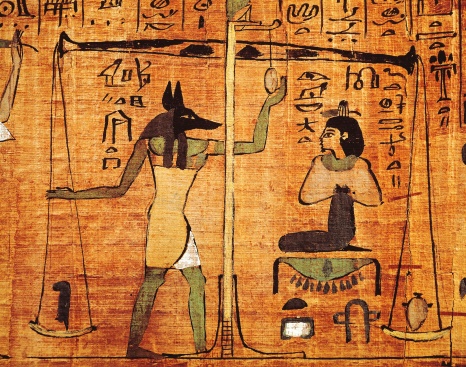
 The Stance. We've had plenty of humanoid pokemon before, but up until this point, only Blaziken ever looked this much like an actual human in a fuzzy costume. Lickarhino's silhouette is just that of some skinny teenager with a dog head instead of a person head, which really only looks good if the design is geared for comedy - like a Bojack Horseman character - or intended to be ominous and surreal, like, I don't know, an Egyptian god of the underworld. Speaking of which...
Kind of a waste of a Humanoid Jackal. Lucaduke is constantly described as "Anubis-like" by the fandom, and that's often cited as one of its strong points. Anubis, however, is actually cool looking. Anubis is portrayed with a sleek, black, sinister Jackal's head and eerie, dignified eyes. If Lurklyo is really supposed to resemble Anubis, then it does about as good a job as Knuckles does of looking like an echidna, and I'm very sorry Knuckles, you are in fact a better character design than Lucario, but you don't look like an Echidna.
The Stance. We've had plenty of humanoid pokemon before, but up until this point, only Blaziken ever looked this much like an actual human in a fuzzy costume. Lickarhino's silhouette is just that of some skinny teenager with a dog head instead of a person head, which really only looks good if the design is geared for comedy - like a Bojack Horseman character - or intended to be ominous and surreal, like, I don't know, an Egyptian god of the underworld. Speaking of which...
Kind of a waste of a Humanoid Jackal. Lucaduke is constantly described as "Anubis-like" by the fandom, and that's often cited as one of its strong points. Anubis, however, is actually cool looking. Anubis is portrayed with a sleek, black, sinister Jackal's head and eerie, dignified eyes. If Lurklyo is really supposed to resemble Anubis, then it does about as good a job as Knuckles does of looking like an echidna, and I'm very sorry Knuckles, you are in fact a better character design than Lucario, but you don't look like an Echidna.
 The Useless Spikes. Everyone's first assumption, when they first saw Lukergeorgie-o and learned of its typing, was that it used the metallic spurs on its hands and chest as weapons. Instead, Lucraniadonk is almost always shown thrusting with its palms, and no purpose is ever even mentioned for the spikes, except that they "channel energy" or some gibberish. Unless, of course, you ask the surprising number of people convinced that the spikes deliberately represent the crucifixion of Jesus. What?
Jorts. Doesn't actually bother me that badly, but I thought I'd point them out.
The Insistence Upon It. Lalaloopioop isn't even a legendary pokemon, yet it's been the focus of a movie and gets pushed on the player like it's something extra special. While you can argue that every pokemon is technically a committee-driven marketing mascot, it feels especially in-your-face here. "What are the kids into these days? Dog heads? Jorts? Spikes for no reason? I think we've just about struck gold here, gentlemen."
The...well, the Disproportionate Popularity of an Anthropomorphic Dog. You got me. It's not the reason, the first reason or even a very large reason this pokemon is so low on my list, but it's there, I can't deny that. While I have nothing whatsoever against furries, there's a "furry bait" theory of Pokemon which holds that the easier it is to conceive a fursona out of a pocket monster, the more embraced it is by the fandom. This certainly seems to be the case, as there's always been a lot of crossover between people who worship Lucario and people who snub their nose at quirky, imaginative "object"-based Pokemon, which they characterize as not only "ugly" but conceptually "lazy" compared to...a dog on its hind legs?
The Useless Spikes. Everyone's first assumption, when they first saw Lukergeorgie-o and learned of its typing, was that it used the metallic spurs on its hands and chest as weapons. Instead, Lucraniadonk is almost always shown thrusting with its palms, and no purpose is ever even mentioned for the spikes, except that they "channel energy" or some gibberish. Unless, of course, you ask the surprising number of people convinced that the spikes deliberately represent the crucifixion of Jesus. What?
Jorts. Doesn't actually bother me that badly, but I thought I'd point them out.
The Insistence Upon It. Lalaloopioop isn't even a legendary pokemon, yet it's been the focus of a movie and gets pushed on the player like it's something extra special. While you can argue that every pokemon is technically a committee-driven marketing mascot, it feels especially in-your-face here. "What are the kids into these days? Dog heads? Jorts? Spikes for no reason? I think we've just about struck gold here, gentlemen."
The...well, the Disproportionate Popularity of an Anthropomorphic Dog. You got me. It's not the reason, the first reason or even a very large reason this pokemon is so low on my list, but it's there, I can't deny that. While I have nothing whatsoever against furries, there's a "furry bait" theory of Pokemon which holds that the easier it is to conceive a fursona out of a pocket monster, the more embraced it is by the fandom. This certainly seems to be the case, as there's always been a lot of crossover between people who worship Lucario and people who snub their nose at quirky, imaginative "object"-based Pokemon, which they characterize as not only "ugly" but conceptually "lazy" compared to...a dog on its hind legs?
Will I ever use zero/five again? I'm honestly not sure. It just felt like I had to after making this thing the bottom-end of the bar.
So there you have it. My complete th-NO, don't you look at me that way, Luigi. You are not going to make me feel bad for what I said about a drawing of a weird dog. Stop it. It's not even your fault. It's the utter mess of a finalized design some dang fool thought was good enough to submit and some other dang fool thought was good enough to approve. There is a good idea in you, somewhere. You had potential. See, look:
We've had two anthropomorphic canine pokemon since Lugrafadulon. One is a shape-shifting kabuki dancer and one is a pyromaniac wizard. These are strong, focused concepts compared to Lucario's ambiguous "maybe-kind-of-anubis-like martial artist" and both of them have pleasing designs with a consistent, organic flow, focused color scheme and minimal accessorizing. It'll be a while before we get to either of these, but I actually predict solid four-to-five ratings for each of them. An anthropomorphic fox is not a concept I'm against just because it's not a concept I'm personally invested in!

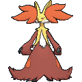
We've had two anthropomorphic canine pokemon since Lugrafadulon. One is a shape-shifting kabuki dancer and one is a pyromaniac wizard. These are strong, focused concepts compared to Lucario's ambiguous "maybe-kind-of-anubis-like martial artist" and both of them have pleasing designs with a consistent, organic flow, focused color scheme and minimal accessorizing. It'll be a while before we get to either of these, but I actually predict solid four-to-five ratings for each of them. An anthropomorphic fox is not a concept I'm against just because it's not a concept I'm personally invested in!
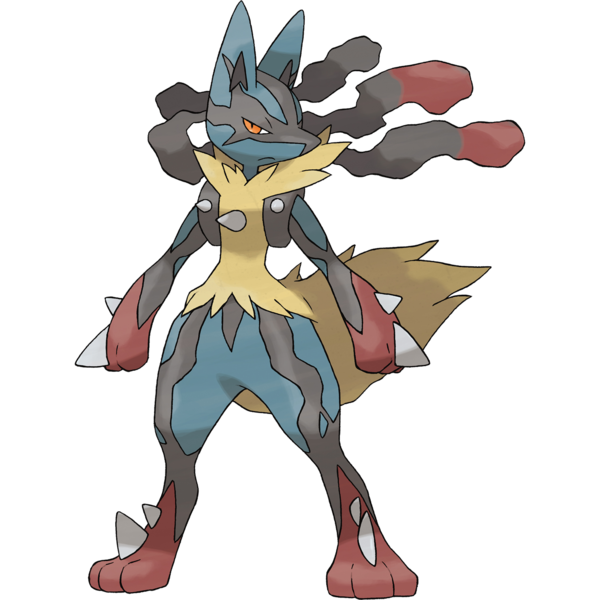
Heck, even the otherwise excessive, predictable mega Lullabutt makes some marked improvements. It still has the terrible mouth placement, boringly human outline and cluttered appearance, but it streamlines the nasty sharpness of its markings into more natural black "veins," ditches the jorts, gives the "hair" a more organic appearance, balances out the whole thing with a bushier tail, adds enough spikes that they feel more purposeful, makes the eyes more menacing and makes them look less like flat stickers. This design does about everything it could to make Lachrymooe look a little better while still looking recognizably like an "amped up" transformation.
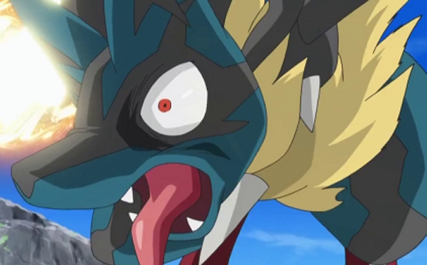
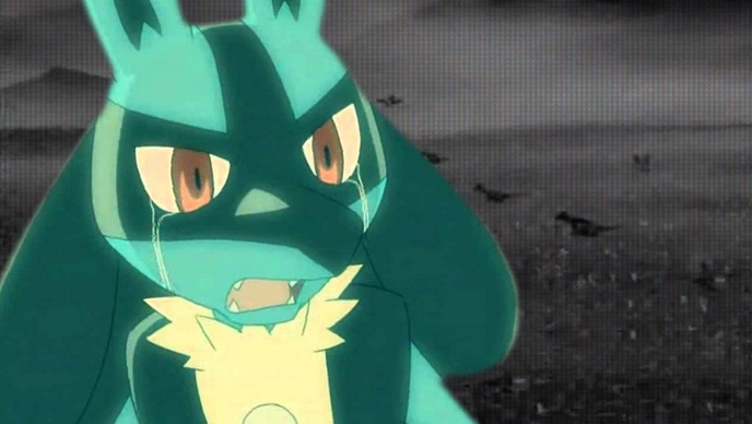
It certainly helps that, in the anime, Mega Luranus was actually animated with a lot of personality, energy and even humor as the mega form apparently just goes apeshit. If we had more of that, I might start to almost like this thing. As a design in itself though, the mega at least manages to become something sort of passable.
See, Lucaducadingdong? A few tweaks here and there, and you're ALMOST not a complete disaster! Almost.
The Not So Quick Fix
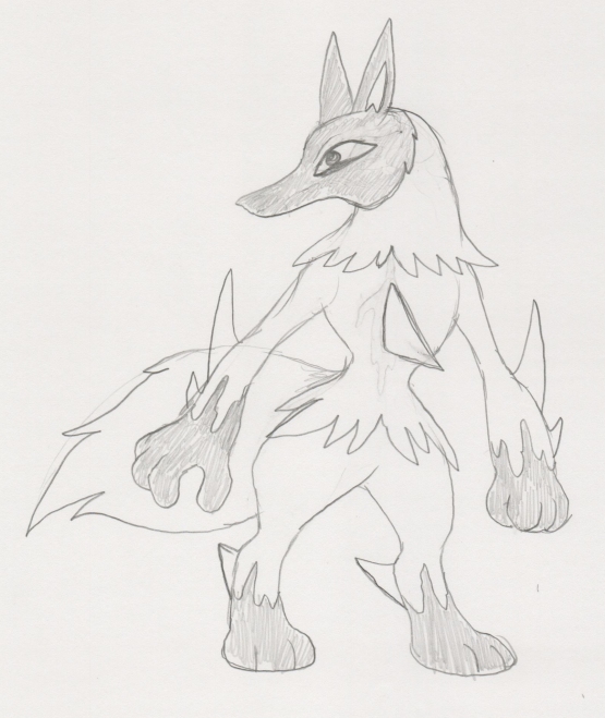
I don't think I've ever draw an anthropomorphic dog before, so this is pretty wonky, but I've tried to make something cooler and more coherent out of Lucario's concept while retaining everything I could of its original design, which isn't all that much as you can see. I guess I made a lot of these tweaks just for fun, and I'd really just like Lucario a whole lot better with a different head, minimum.
Because, let's face it...
Because, let's face it...
:(


FIRST PREV ARCHIVE NEXT LATEST