


The Gible Family
Today, we have one of the franchise's all-time most popular and most powerful monsters. These two things don't usually mesh well with my kind of pokemon, but the Gible line is something I can completely support. These ground/dragon types are referred to by the pokedex as "land sharks," and that's exactly what you get. They're monstrous, saurian sharks with arms and legs, and also they count as dragons. Nice.
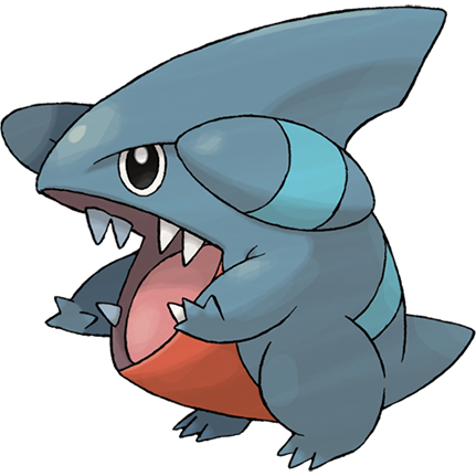
As a first stager, Gible is suitably stumpy and adorable, with the most perfect grumpy lizard eyes for such a hilariously round and nubby creature, actually a lot more piranha-like than even Carvanha.. It still looks like it could mess you up pretty bad, though. The idea of a shark-like predator that tunnels through sand and soil has been one of my favorite tropes since childhood, even before I ever got to see the movie Tremors, and I'm really glad it cropped up as a pocket monster.
As a first stager, Gible is suitably stumpy and adorable, with the most perfect grumpy lizard eyes for such a hilariously round and nubby creature, actually a lot more piranha-like than even Carvanha.. It still looks like it could mess you up pretty bad, though. The idea of a shark-like predator that tunnels through sand and soil has been one of my favorite tropes since childhood, even before I ever got to see the movie Tremors, and I'm really glad it cropped up as a pocket monster.
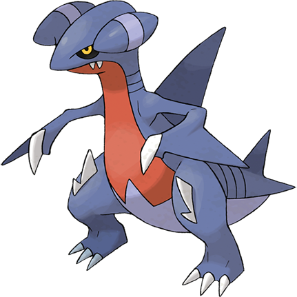
Gabite already looks a lot like a complete, evolved pokemon, and would have been perfectly acceptable as such, but this is still only our middle-stager...
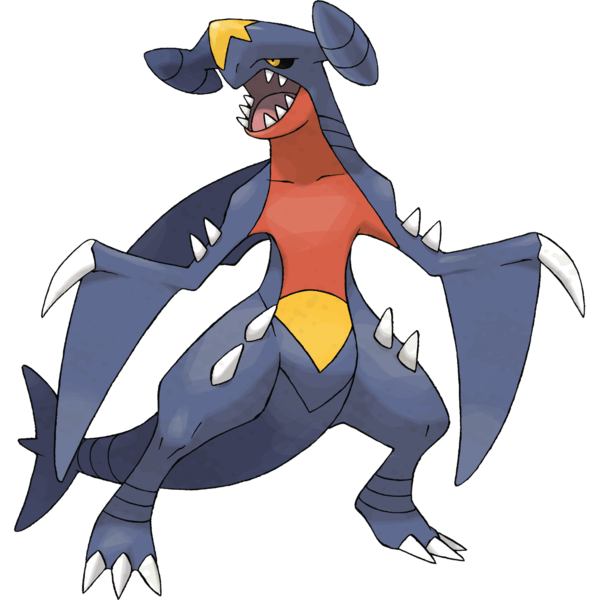
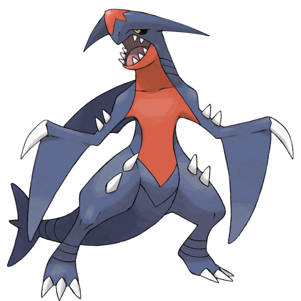
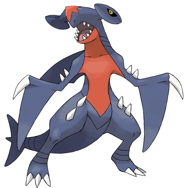
The final stage, Garchomp, is one of pokemon's single most pugnacious looking brutes, a muscular humanoid shark with an almost mantis-like stance and such a lovably grim visage, with eyes that look almost mournful for the amount of dismemberment it's about to inflict on somebody, which we can tell at a glance is going to be far more dismemberment than was probably necessary.
It's all just totally cool as heck, except for two problems I have with the design:
First, the yellow elements. Completely unnecessary, and a repeat from Sharpedo.
Second, those things on their heads. What's up with those things? They just look awkwardly glued-on until Garchomp, when they finally look more like airplane wings, which is interesting, don't get me wrong, I've said before how I respect the number of pokemon that also look like airplanes, but I always felt like they were just slightly "too much." I don't know what, if anything, I'd replace them with, since it looks kind of bald without them; maybe just something "simpler?"
I'm accustomed enough to Garchomp as-is that this looks very, very off to me, but if Garchomp had always been a little more "streamlined" like this, I'd have probably wound up liking its design a little more in the long run.
And just for fun, here's how Garchomp would look if it were a "hammerhead" land shark, which is what I initially thought the headgear was going for back when we saw only small, blurry sprite leaks of the thing.
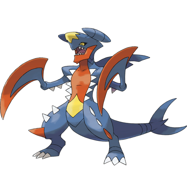
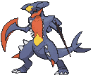
Amazingly, a pokemon so popular and so competitively viable even has a mega form that I don't find an eyesore, at least not any more than the elements that bug me on regular Garchomp. It's only slightly modified, but this thing is terrifying. Just the more humanoid lower jaw gives it such a scarier personality, and the fins are now head-lopping scimitars with an even mantisier vibe to them.
I also don't usually comment on shinies since not a whole lot of them have really surprising or meaningful color schemes, but shiny mega garchomp is INTENSE, as pointed out by QuantumWaltz in the comments, and you know what? The creepy chin alone already reminded me of something, but only the shiny version really drove it home for me:

I also don't usually comment on shinies since not a whole lot of them have really surprising or meaningful color schemes, but shiny mega garchomp is INTENSE, as pointed out by QuantumWaltz in the comments, and you know what? The creepy chin alone already reminded me of something, but only the shiny version really drove it home for me:

Dracosharkplanes are pretty badass.


FIRST PREV ARCHIVE NEXT LATEST