Article Interlude:
What's With the Art?
So I brought this up reviewing Spidops, and I talked a little more about it on my personal blog, but as soon as I saw the full release of "official art" for these new Pokemon, something stood out like a glaring eyesore about several of them. Unfortunately, wherever I've seen this topic brought up elsewhere (especially on twitter) it was met with an almost baffling degree of confusion and controversy, so let's just start this explanation from scratch:
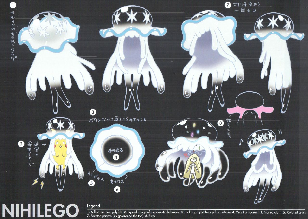
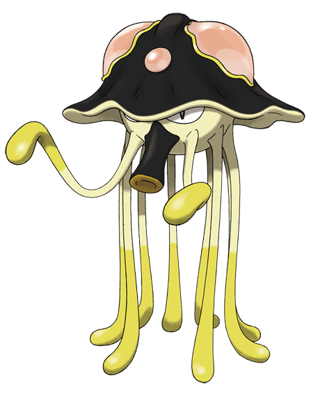
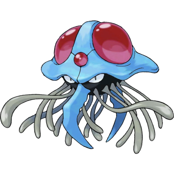
Here, we have the CONCEPT ART of our beloved paradimensional brainsucker, Nihilego. A conceptual sheet like this is what almost all characters and objects in a final video game, film or animation are based upon.
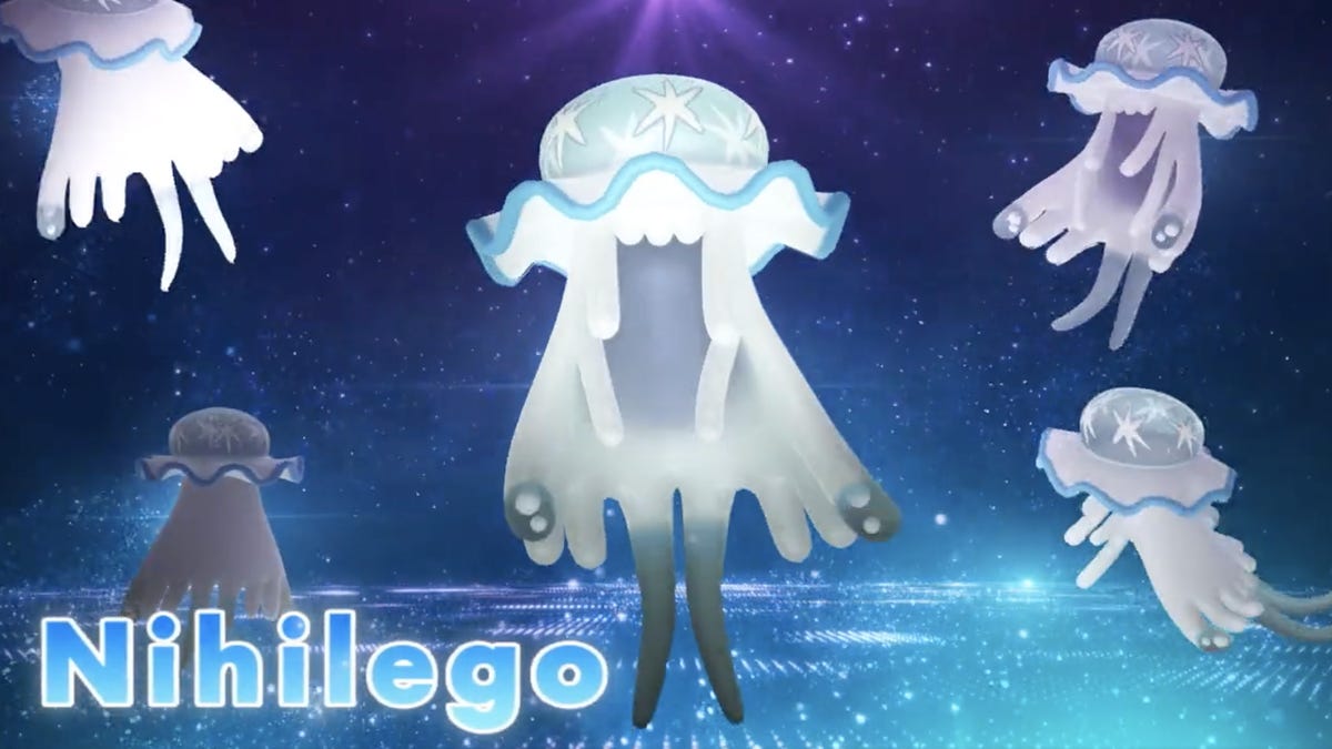
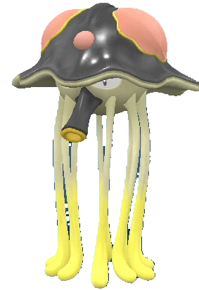
Now, here's Nihilego's in-game model. This would have used the conceptual art as reference. Someone did a pretty superb job of that! It's just a little "stiffer" and more "symmetrical" than any of the concept drawings, because that's just the way it functions and animates for the purposes of the game.
And finally, here's Nihilego's "main" illustration, or what we'll just call its pokedex art for ease of distinction. This is not its concept art; this pose isn't anywhere on the concept sheet we already saw. It's new art that would have used the conceptual art as a reference, or maybe it used the 3d model as a reference, but it was still hand drawn specifically to be the pokedex art. I suspect the "bell" could have used part of the 3d model as a base, perhaps, but no matter how close this image looks to the model, any scrutiny should reveal that it's not perfectly symmetrical; every tentacle is of slightly different thickness, elements like the star pattern and the waving rim of the bell just subtly imprecise, it has a hand-drawn flow to it that the model can come close to, but not perfectly match.
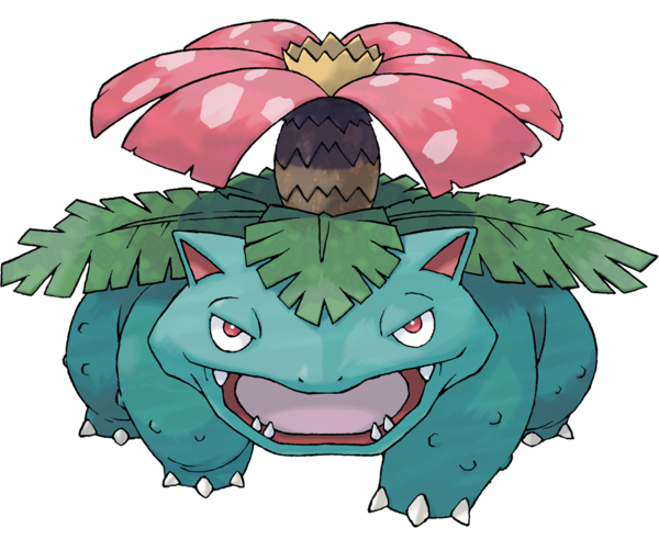
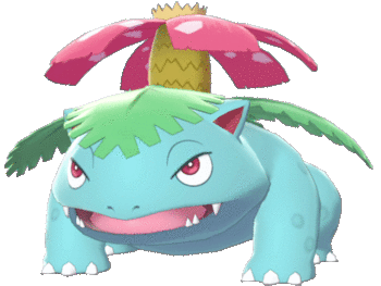
Let's compare some other differences between "pokedex art" and in-game model, shall we? We can start with one of the most recognizable classics, the first fully-evolved Pokemon in the original dex:
Venusaur differs quite a bit between pokedex art and in-game model! The model serves its own purpose, but its "cleaner" in way that isn't necessarily an improvement. The geometry is simpler, the warts are just a texture, the legs don't have the same pleasant taper, even the size and placement of the eyes differs just enough to convey a different personality. In my opinion, the "dex art" is the truest representation of a Pokemon, and not just because it came first in this instance. It's the image the team chose to finalize as the public "face" of the design, the most canonical example or type specimen of what exactly one of these Venusaurus thingies are supposed to look like.
Now here's one of my favorite Pokemon designs. Hi, Sliggoo! Decent 3-d model, but again, it's pretty obvious that the dex art was drawn separate. It's adorably uneven and gooey! It's "flatter looking" than the model, but it's supposed to be. It's a cartoon!
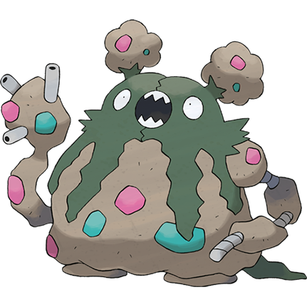
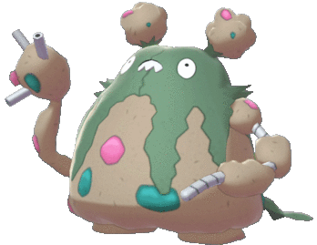
Maybe you know Garbodor is my favorite Pokemon of all, but did you know I'm not a fan of its 3d model? The differences are subtle, I admit, but they're there. The face is smaller, the "trash" is smoother, the whole thing is a bit puffie and it just doesn't feel quite as dynamic to me as the screaming blob of filth I first saw.
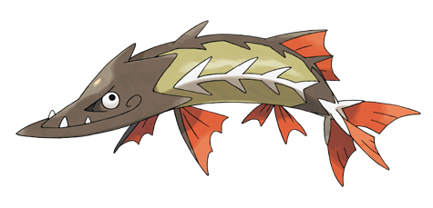
Now for an example from just our previous generation: Barraskewda! This was the first generation in which the "digital" Pokedex (in Pokemon Home) recreated the exact poses of the official artwork, but even when posed the same, you can see that this big fishy's dex art is a drawing someone made separately from the model; notice the drawing's spines are generally thicker, and the head of the model has a straighter, more conical shape compared to the lively curvature of the drawing's lower jaw. As someone so invested in creature design, these are differences that really do affect the! Sorry veepee visitors for being so "autistic" about things like this all the time, but, glass houses.
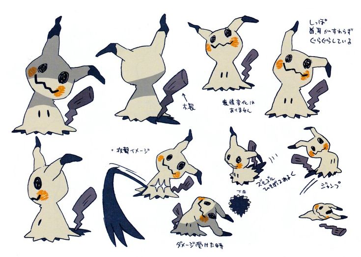
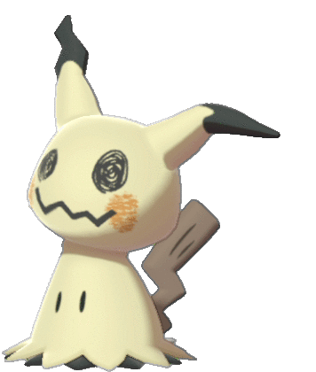
Sometimes, of course, the pokedex art is just lifted whole cloth from the concept art, like Mimikyu here, so there's no question that the game model came later, informed by these delightful hand-drawn poses!
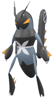
So, tell me if you recognize what I recognize in some of these brand new Pokemon and their final dex illustrations:
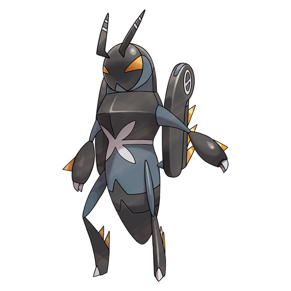
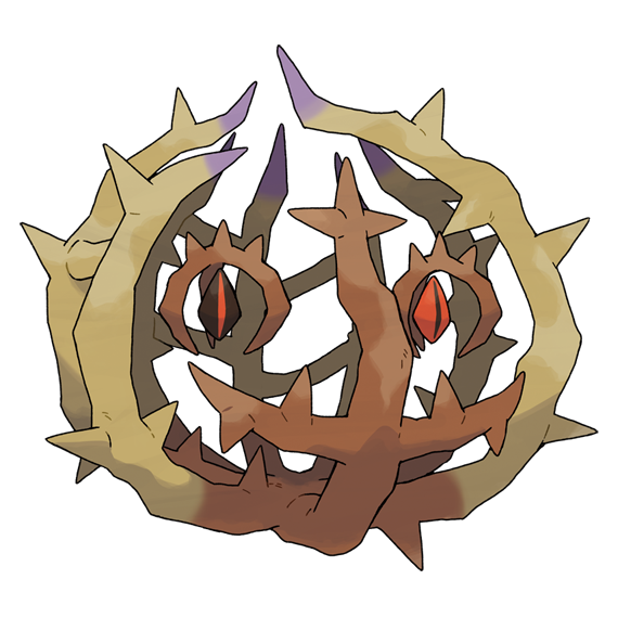
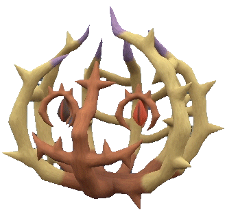
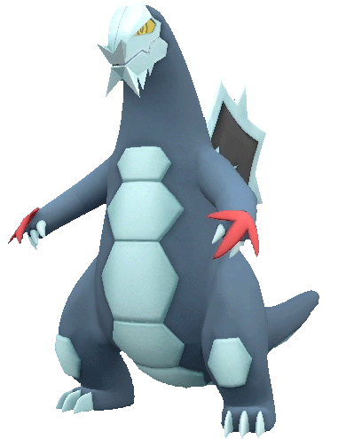
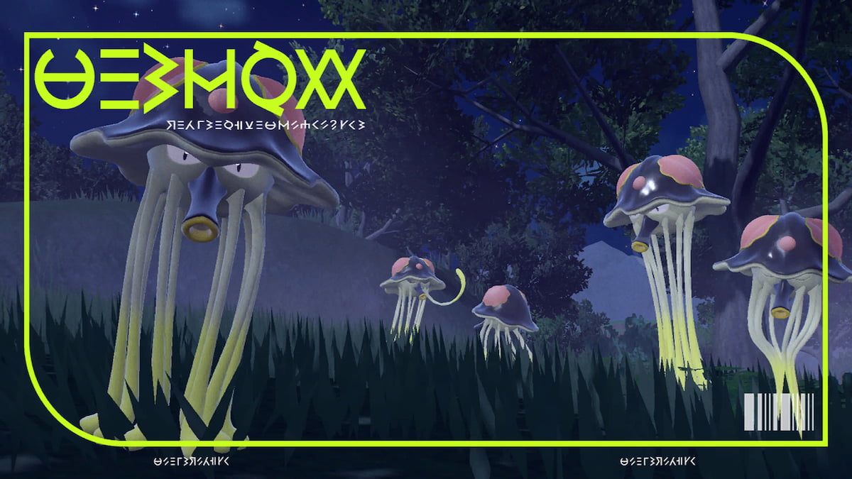
As an artist (I guess) and animation lover, it sticks out to me like a sore thumb that at least a few of the gen 8 "dex art" images follow the 3-d models so precisely, there's no way an artist simply did these by hand that carefully. The models are a little more squashed, stretched, or repositioned in places, but the almost mathematically perfect similarities and flawlessly symmetrical dimensions aren't something a human hand can do without hours more work for a result that's indistinguishable from outright tracing the original object anyway. From Toedscruel's exactly identical tentacle proportions to Brambleghast's precise sequence of bent angles on every single branch, this is probably the first time any of the pokedex art was blatantly drawn overtop the final 3-d models, or in Toedscruel's case, it looks more like the model was immediately run through a 2-d shader with no additional tweaking or touch-up at all.
And frankly...it looks terrible.
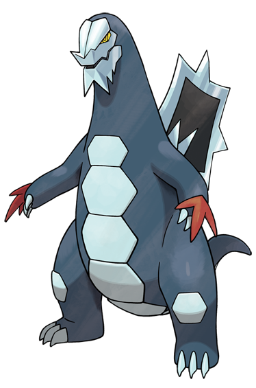
I actually like 3-d artwork with 2-d stylization. It's a powerful technique for animation that I think occupies a distinct aesthetic niche from either true 2-d or more realistically textured 3-d. It's not that the style of Toedscruel or Baxcalibur's dex images look bad, no, and in fact it would positively rule of they looked that much like drawings in-game.
But it doesn't look great for the primary static images representing these Pokemon, at the very least not in the straightforward poses they chose for some of them. It makes me sad that this was done, even just for certain Pokemon, because it just doesn't make them look as good as pure hand-drawn artwork can, and other Pokemon from this very generation can illustrate that point.
ACTUALLY GOOD GEN 9 ART:
I like all three of these Pokemon, but I like them slightly to significantly more from the illustrations than from the models; Maushold especially feels stiffer and blander in 3-d, but its official artwork really helped me appreciate the Sanrio Mascot style it was going for, while Greavard has wavier fur and more rounded teeth, among other details.
So why were some Gen 9 Pokemon given dex drawings "from scratch," while others appear to use part (or all) of their in-game model as their base? Was it quicker and easier in the haste of the final crunch, and cheaper than it would have been to hire additional, outside help? Were some of the illustrators just not even sent the original concept art, but were sent the models?
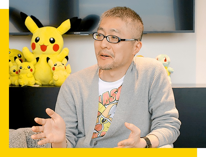
I'm sure a big part of this is because the role of Ken Sugimori in Pokemon development has steadily diminished in recent years. At one time responsible for finalizing every Pokemon and designing such favorites as the Gastly line, Mewtwo, Gyarados and Snorlax, the rapid expansion of the franchise and accelerated release schedule would necessitate a more expanded illustration team as early as the third generation. By Sun and Moon, his position had already shifted much more to giving guidance to the art team while he worked on other projects, and by Sword and Shield, it's unclear if any Pokemon were ever worked on by Sugimori himself. For Scarlet and Violet, he's credited exclusively as Visual Studio Supervisor.
Another reason? There's actually substantial evidence that some Pokemon may have been added to these games at virtually the last minute. Toedscruel, for instance, is actually referred to by the game's code as OKAGYARADOSU, indicating that a Gyarados-based Pokemon was originally planned to occupy its Pokedex slot. Some Pokemon were, perhaps, added so late in development that there wasn't time to commission artwork up to their past quality standards. It's also possible that some artwork was deemed unsatisfactory, came back inaccurate to later aesthetic changes or was even lost to some human error along the way, and so their models were quickly repurposed with a 2-d style paintjob.
Even if you still don't believe me that 3-d models were used as a shortcut at any point, that you're positive some of these drawings were simply drawn exactly like a 3-d model standing in place for some reason, you can't honestly say that the results are anywhere near as appealing as they could have been, and maybe it doesn't matter at all to you, and that's fine, but the "main art" has always been my personal favorite part of every Pokemon, and it's always been how I ultimately judge them for these very reviews!
Surely, anybody who can see these can also see something a little sad here...right?
I thought I'd get this out of the way now, pretty much as soon as I had to bring it up after Spidops, so I can go ahead and review the remaining Pokemon without complaining about it again.

Let's compare some other differences between "pokedex art" and in-game model, shall we? We can start with one of the most recognizable classics, the first fully-evolved Pokemon in the original dex:


So, tell me if you recognize what I recognize in some of these brand new Pokemon and their final dex illustrations:
And frankly...it looks terrible.
Dorohedoro
I actually like 3-d artwork with 2-d stylization. It's a powerful technique for animation that I think occupies a distinct aesthetic niche from either true 2-d or more realistically textured 3-d. It's not that the style of Toedscruel or Baxcalibur's dex images look bad, no, and in fact it would positively rule of they looked that much like drawings in-game.
But it doesn't look great for the primary static images representing these Pokemon, at the very least not in the straightforward poses they chose for some of them. It makes me sad that this was done, even just for certain Pokemon, because it just doesn't make them look as good as pure hand-drawn artwork can, and other Pokemon from this very generation can illustrate that point.
ACTUALLY GOOD GEN 9 ART:

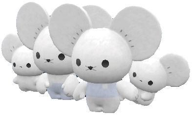


I like all three of these Pokemon, but I like them slightly to significantly more from the illustrations than from the models; Maushold especially feels stiffer and blander in 3-d, but its official artwork really helped me appreciate the Sanrio Mascot style it was going for, while Greavard has wavier fur and more rounded teeth, among other details.
So why were some Gen 9 Pokemon given dex drawings "from scratch," while others appear to use part (or all) of their in-game model as their base? Was it quicker and easier in the haste of the final crunch, and cheaper than it would have been to hire additional, outside help? Were some of the illustrators just not even sent the original concept art, but were sent the models?
Even if you still don't believe me that 3-d models were used as a shortcut at any point, that you're positive some of these drawings were simply drawn exactly like a 3-d model standing in place for some reason, you can't honestly say that the results are anywhere near as appealing as they could have been, and maybe it doesn't matter at all to you, and that's fine, but the "main art" has always been my personal favorite part of every Pokemon, and it's always been how I ultimately judge them for these very reviews!

I thought I'd get this out of the way now, pretty much as soon as I had to bring it up after Spidops, so I can go ahead and review the remaining Pokemon without complaining about it again.
All Scarlet/Violet sprite animations ripped by adamsb0303!


FIRST PREV ARCHIVE NEXT LATEST