Written by Jonathan Wojcik
Fifteen Favorite Funny Fiends!
Some of my all-time favorite artwork and favorite creature designs are the Topps
Ugly Stickers by Basil Wolverton and Norman Saunders, all of which I review in detail
HERE and have long considered one of my biggest inspirations.
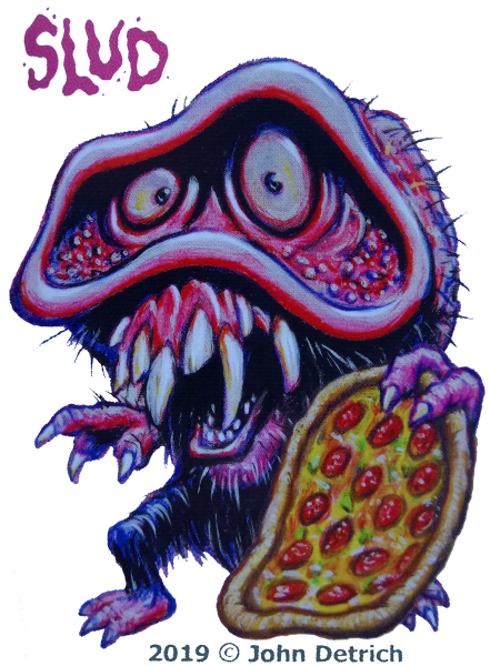
I'm not alone in that, either; just last year, two artists got together to create their very own, brand new spiritual successor to the Ugly Stickers, which saw a successful kickstarter just in time for the cards to ship this very Halloween season. John Detrich and Stephen Blickenstaff's
Funny Fiends have an official home on Facebook
here, and as a Kickstarter backer, I just received my full set of 100 monster stickers merely weeks ago.
These are my
fifteen favorites, because then it's alliterated.
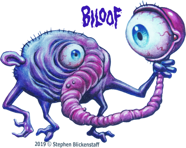
Let's start with BILOOF! What an absolutely lovable fella! Just a round, purple, raisin-looking critter whose left eye is not only a lot bigger, but situated on a long, wormy stalk Biloof is amusingly holding up almost like a hand mirror. I like the lack of almost any other visible facial features. If Biloof has a mouth, it's not visible at this angle!
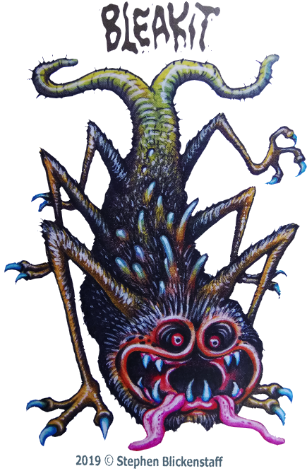
BLEAKIT might be, objectively, one of the best looking Funny Fiends. There's just so much detail in this one, the hairs so meticulously colored and highlighted to look like really bristly, greasy rat fur! Love the dual tongues and dual tails, and the ghoulish face with those deep, dark eye sockets.
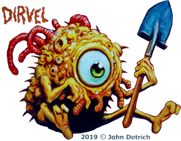
DIRVEL is extremely simple, just a fat little yellow spud of a cyclops, but the pores, warts, and worm-like skin growths add a lot of flair to the design, the huge size and perfect roundness of the eye is adorable, and he's got a SHOVEL! You can practically tell by looking that Dirvel loves dirt!
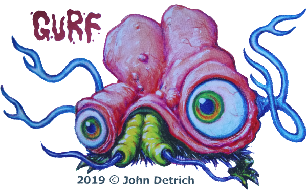
GURF is one of the several Fiends who feel like homages to my favorite Ugly Sticker up top there; monsters that almost look like a set of organic goggles or binoculars with just enough of a blobby body attached. Gurf is a little more brain-like and pretty charming for it, a kind of design I've done many times myself and even a little reminiscent of how the alien brains were portrayed in
Courage the Cowardly Dog.
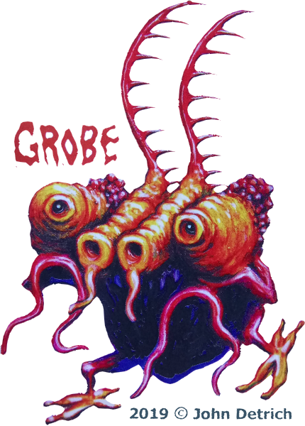
GROBE is amazing, because with those tiny, beady black eyes in almost chameleon-like turrets, it has a more alien feel than most of the other fiends. The red tentacles and spiny antennae definitely further that, and an overall texture that reminds me of gnarled, knotty wood.
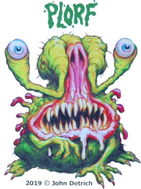
I think PLORF here would likely be a fan favorite. One of the beastlier, more dangerous looking Fiends but still exhibiting a cuteness to it, thanks to those lidless eyeballs and almost frightened expression. I like the pink jaws leadinging into the pink nose, nicely framed by those single-jointed, fleshy eyestalks.
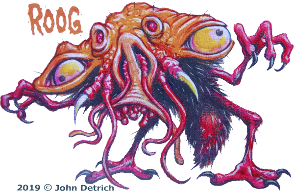
ROOG is another that more directly takes after some of the more famous Ugly Stickers, and perhaps a little dash of
Brundlefly. I am just loving that wide, warty head and various facial tendrils, polyps, pits and spines; a creature whose anatomy manages to feel convoluted and randomized even while being fairly symmetrical. I also love the intense red of the abdomen against the black, sharp looking hairs, which reminds me of a mosquito full of blood.
Could Roog be vampiric???
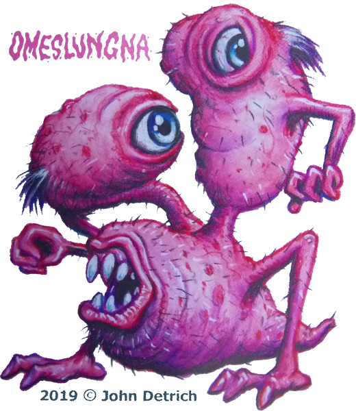
Lots of personality in OMESLUNGA. That color and texture of an unshaved, flabby human with bad skin goes a long way to giving this creature a disturbing yet comical feel to it, and the anatomy with a single eye and single arm to each bulbous, stalked "head" is extremely unique! Even the name fits perfectly, sounding precisely like the kind of thing that might be shouted by this caveman-looking mutant.
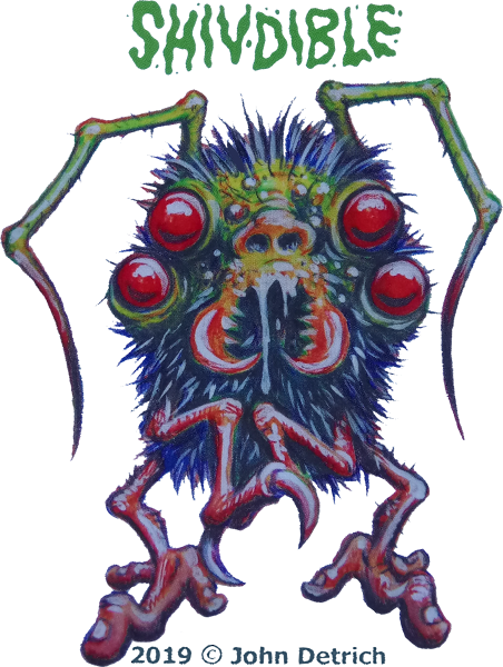
This is surprisingly one of only two especially arthropod-like Fiends, at least in terms of the facial area, but that was something TOTALLY missing from the original Ugly Stickers and definitely missed. Shivdible is one of the few "just scary" Fiends, insofar as its red, alien eyes and expressionless mandibles feel more serious and formidable. The name, too, is quite eerie!
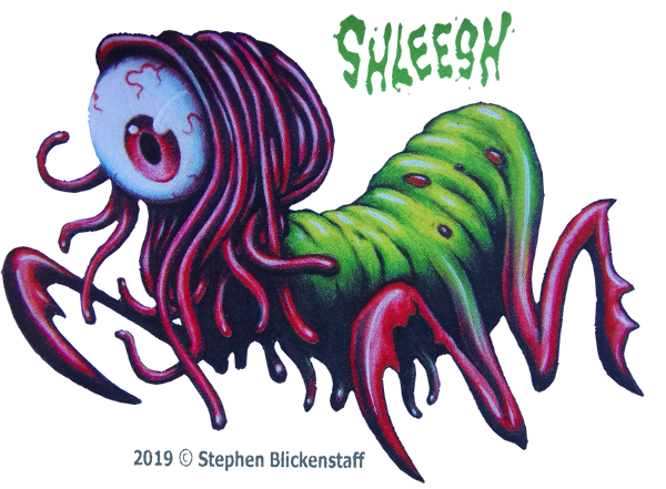
SHLEESH might be one of my top favorites of all; the bright green, wrinkly, sausage-shaped body, reminiscent of a caterpillar, is very pleasing to the eye with its redder, sharper limbs, and the single big, bright, curious eyeball framed by a "hairdo" of thick, worm-like tentacles makes for a beautiful, interesting face full of character.
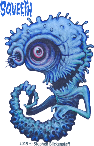
SQUEETH would *almost* be another scary one if it wasn't smiling so wide. Lots of lovely details, too; that porous, almost coral-like tail is just amazing, and the fleshy fringes lining its mouth are evocative of teeth without it actually having any. Add in that the whole creature feels like an extremely distorted crescent moon to me, and maybe a dash of seahorse, and you have an extremely memorable entity I could easily see drifting through the cold depths of space or deep beneath the sea.
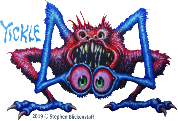
YICKLE is just amazing! I'm a huge fan of monsters with just a pair of long legs, but I'm also a huge fan of monsters with eyeballs in weird places, especially on stalks or long appendages of any kind. Yickle's multiple nostrils give an impression of a very creepy, almost rotten-looking face with eyes missing from its tiny sockets, but of course the real eyes are on those shaggy, bright blue "arms," and stare at is with an endearing air of innocence even while the face behind them looks eager to gnash on some bones!
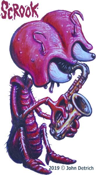
SCROOK is the other insectoid I mentioned, and everything about Scrook is superb. I'm really delighted by the huge, ant-like helmet of a head, how the conical eyeballs peek out of its dark recesses and how we can't really make out the mouth or anything else. I even love the point between the eyes being lined with hair, which is a minor detail but looks so good! The thin, humanoid bug-man body really ties it all together, giving Scrook the feeling of a cute-but-spooky Martian or Moon Man from older science fiction comics. Plus, I bet Scrook ROCKS that Sax!
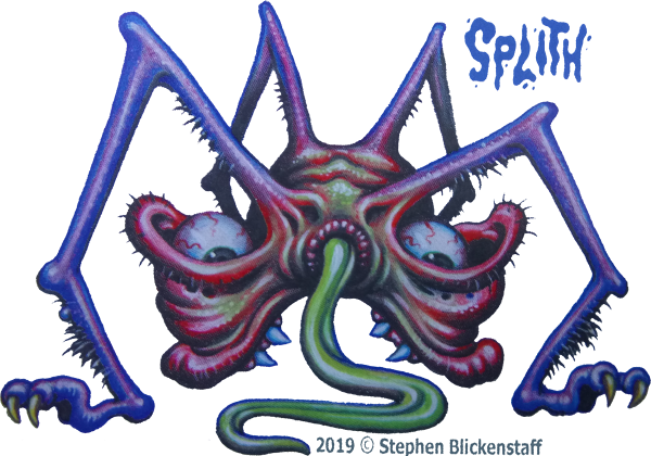
It's a tough call, counting some I didn't spoil here, but I think SPLITH is actually the "creepiest" or "grossest" looking Fiend. I'm not really someone who has a sense of anything being "ugly," but the eyeballs just sort of lying in those saggy sockets and the green, slick tongue protruding from what looks far too much like an anus all makes for a wildly
unwholesome organism...not that I expect Splith, or any of the Fiends, to actually be unsavory folks. They're the FUNNY Fiends! No matter what they look like, I'm sure most of them just want to have a good time!
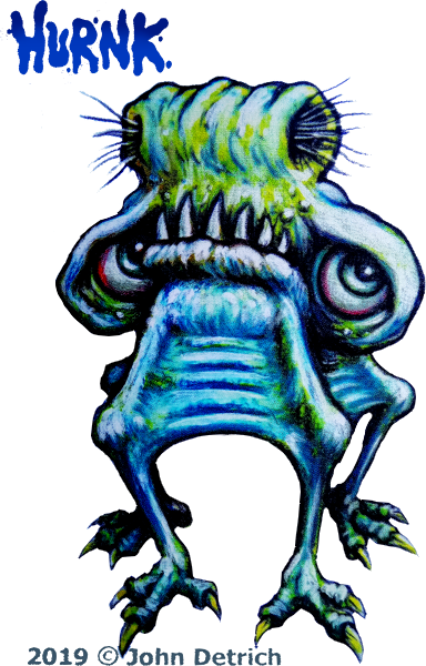
There are many other designs I love among the Fiends - there's a hundred designs in all! - but I have to show you Hurnk, because...god....look at them. What did you do to make Hurnk sad?? I know it was you because
I sure wouldn't do anything to disappoint that face. I'd sooner
die.
Every single one of these creatures are beautiful in their own way. The vibrant colors, fleshy and fuzzy textures, inventive designs and often ingenious poses don't just make a worthy "tribute" to the Ugly Stickers, but actually
exceed them in many way, feeling more like a modern "expansion" on the concept and a more than satisfactory reboot for today's generations...though there
is a complaint I have, of sorts.
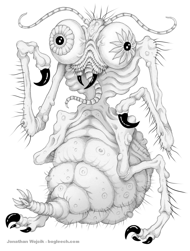
Here's one of my own monster designs from the setting I call
Mortasheen, which to date I have populated with over six or seven hundred creatures. You can probably tell at just a glance that I was always going for an "Ugly Stickers" style myself, and spent years practicing wrinkly, warty, lumpy, scuzzy flesh.
...But, as proud as I am of many of my designs, I feel as though I never quite got into pushing their anatomy to be as weird as either the original "Uglies" or the new "Fiends," perhaps falling too quickly into the trap of basing Mortasheen creatures on obvious objects and animals.
Worse yet, I feel as though my shift to full color and digital art really lost something special. I don't intend to go back to monochrome pencils - I want to push forward, not fall backward - but even my monsters intended to be fairly "grody" have too smooth, too slick, too clean a feel to me these days, and despite them being my two favorite features, I still don't have the knack for either bulging eyeballs or scuzzy hairs that Detrich and Blickenstaff have perfected so well. I haven't even been making my monster's teeth look as nice as theirs and that's easy as pie!
So, my "complaint" with the Funny Fiends - and here's an extra sixteenth for you - is simply that
they made me feel bad. They're doing everything I wanted to do with my own art, from the variety of anatomical plans to the look and feel of their surfaces and details, in a way that I personally like significantly more than anything I've been doing lately. I realize a part of their organic, dirty feel is because they're made with
real, actual paints on paper, but I could have still spent the past decade better learning how to texture my digital work, blend my highlighting and shading better, and finally learn how to make a damn eyeball look correctly three-dimensional.
I guess the
Funny Fiends just give me a big boost of inspiration, but it's the kind of inspiration that makes you kick yourself, too. The next few Mortasheens I churn out, you might start seeing a bit more of a return to their Ugly Sticker roots, cause I can't let these two guys pull this far ahead of me, this suddenly!
Here, have a seventeenth too. Sorry I broke the alliteration.
MORE HALLOWEEN FEATURES:
WAYS YOU CAN SUPPORT THIS SITE!